Mirinda Learned to Smile Again

Mirinda has always been one of the loudest brands on the shelf. Bright colours, bold flavours, and an unapologetically fun personality made it instantly recognizable. But over time, that distinctiveness began to fade. In a crowded soda market, relying heavily on colour and logo wasn’t enough. The connection to flavour the very core of the product became less immediate.
This rebrand changes that. And importantly, it doesn’t try to reinvent Mirinda. It refocuses it.
Going Back to Move Forward
Instead of chasing trends, the new identity looks back. Drawing inspiration from visual styles of the 60s, 70s, 80s, and 90s, the rebrand reconnects with what Mirinda has always stood for - playful energy, expressive design, and bold flavour.
But this isn’t nostalgia for the sake of it. It’s controlled nostalgia. The past is used as a foundation, not a costume.
Flavour Becomes the Hero
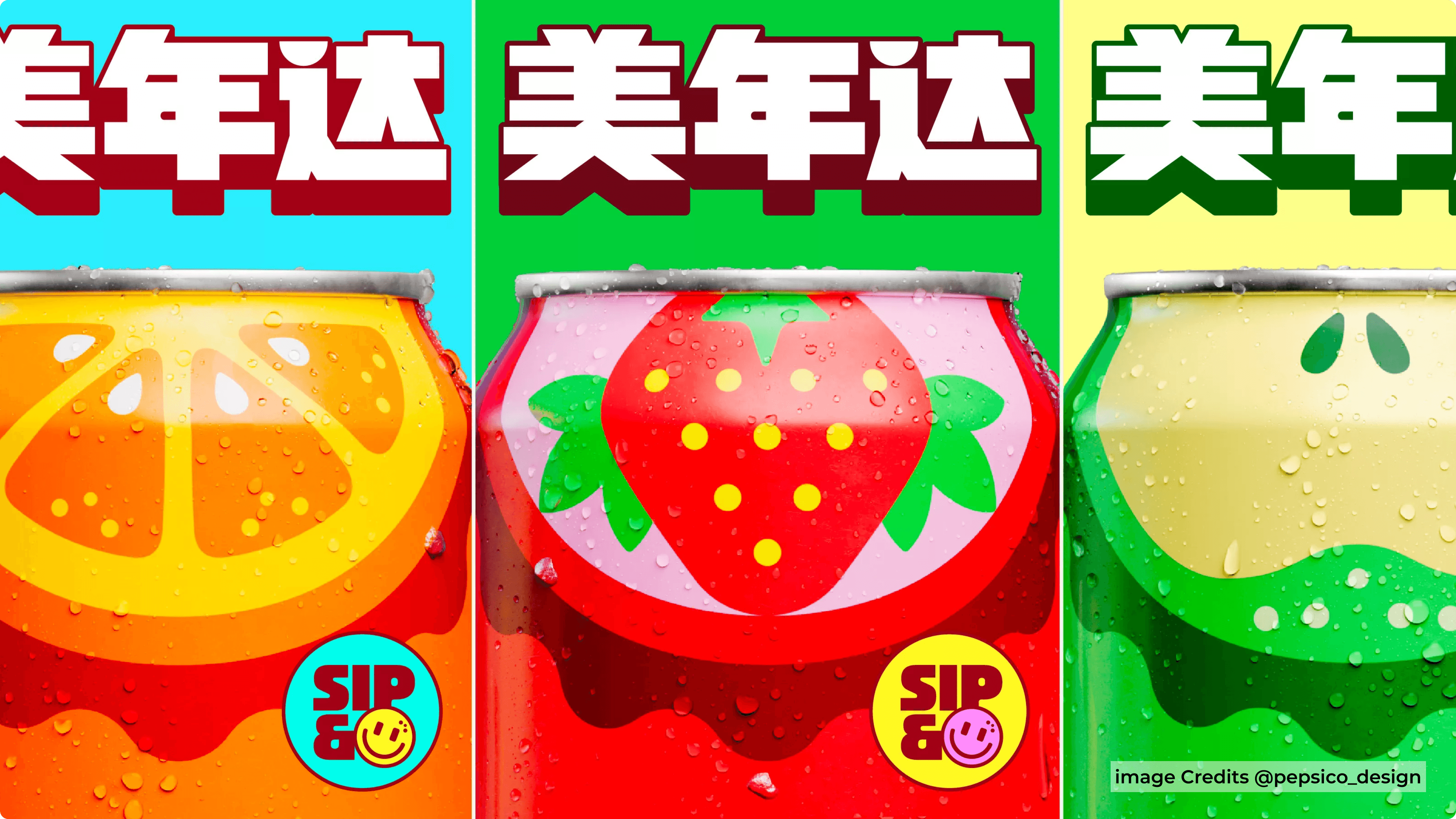
The biggest shift is simple but powerful: flavour is now the most important visual element.
Earlier, you noticed Mirinda because of its colour. Now, you understand it because of its flavour.
Fruits are transformed into bold, oversized graphic forms built using simple semi-circular shapes. These shapes are not just decorative - they are functional. They create a consistent visual system that is easy to recognize and hard to ignore.
Each flavour gets its own strong colour and clear identity. No guessing. No searching. You see it, you get it.
The “Smile” That Ties It All Together
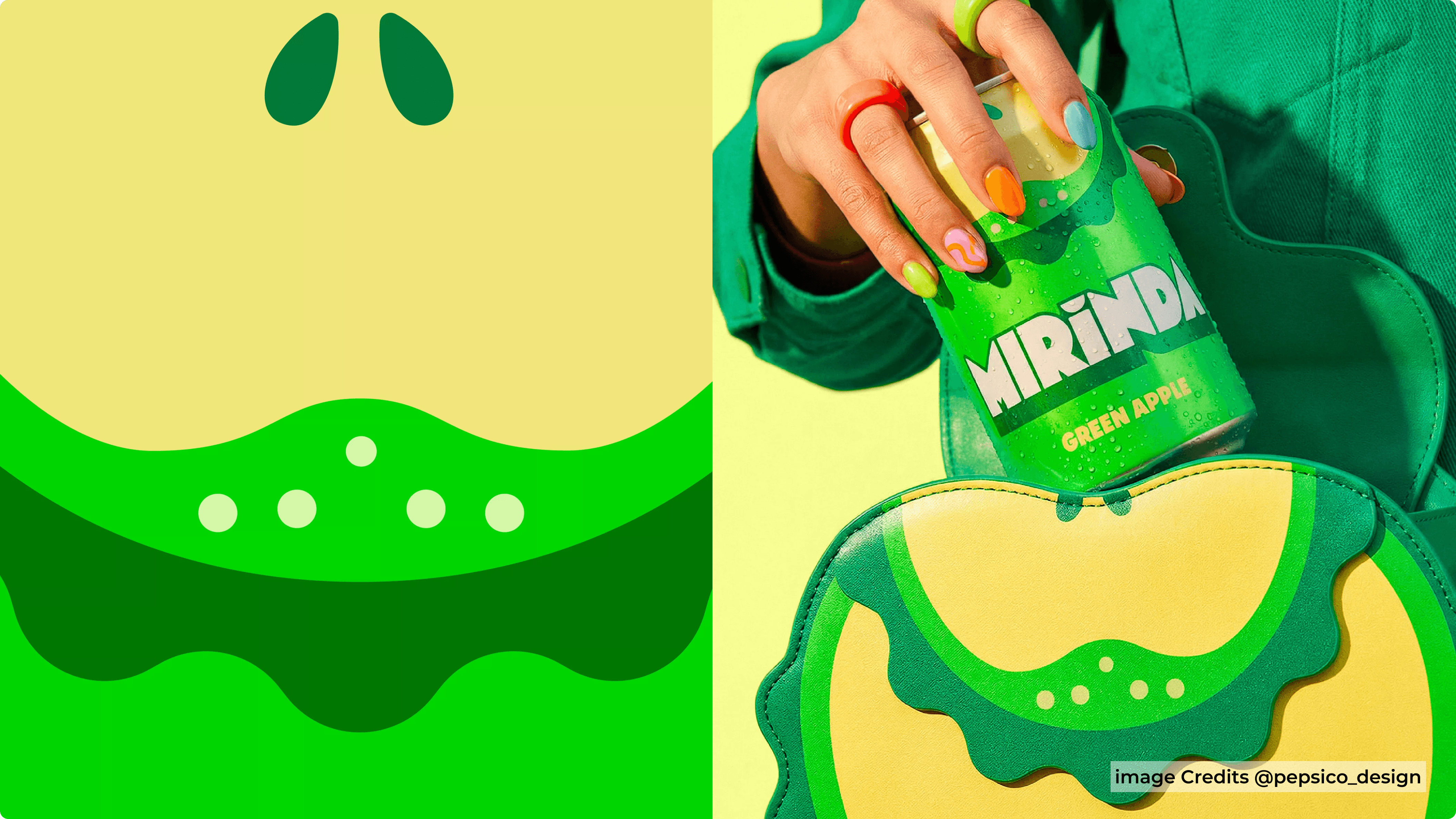
One of the smartest details in the system is also the most subtle - the hidden smile.
A semi-circular curve runs across the design language, quietly reinforcing Mirinda’s core idea of joy. It’s not loud, it’s not forced, but once you notice it, it’s everywhere. This is the kind of detail that elevates branding from decoration to meaning.
A Typeface with Personality
The custom typeface, “Mirinda Burst,” plays a major role in the new identity. It’s sharp, expressive, and instantly recognizable. More than just typography, it acts as a branding device.
When combined with the fruit shapes, it creates a cohesive system that works across packaging, marketing, and digital touchpoints. It’s consistent without being repetitive - which is harder to achieve than it sounds.
Standing Out Without Overcomplicating
Most beverage brands today follow one of two paths: ultra-minimal or overly premium. Mirinda chooses neither.
Instead, it simplifies without losing energy.
The design feels loud, but controlled. Playful, but structured. This balance is what makes it effective. It doesn’t try to look sophisticated - it tries to be clear. And clarity wins on a crowded shelf.
Designed for the Shelf, Not Just the Screen
One of the biggest wins of this rebrand is improved shelf visibility.
With strong colour blocking, bold fruit icons, and a distinctive typeface, the product becomes easier to spot instantly. In a category where consumers make split-second decisions, this matters more than anything else.
Because let’s be honest - no one stands in front of a fridge analyzing design systems. You grab what catches your eye in two seconds.
Final Thoughts
The Mirinda rebrand is a great example of doing less, but doing it better.
It strips away unnecessary complexity and brings the focus back to what actually matters - flavour, fun, and recognition. By building a strong visual system around these ideas, the brand feels both familiar and refreshed.
It doesn’t try to become something new. It just becomes more of what it always was.
And sometimes, that’s exactly what good design is supposed to do.